Trade exhibitions have always been an important aspect of corporate marketing since they give firms a great method to show off their products, meet potential customers, and make their brands more visible. But it’s harder than ever to stand out when so many brands are trying to get people’s attention. Color is one of the most important yet frequently ignored parts of a successful trade show.
Choosing the appropriate color for your trade show booth does more than just make it seem nice. Colors can alter how people feel, how they act, and even how they make decisions. Color is predicted to be increasingly more important in booth design as firms get ready for trade show trends in 2025.Keeping up with the latest trade show booth design trends will make your company stand out, whether you want eco-friendly colors or vibrant digital palettes.
In this post, we’ll look at the most popular colors for trade show booths in 2025, the reasons behind these choices, and how to use them in your next expo stall design.
Why Colour Is Important for Trade Show Booths
Before we get into the trends, let’s talk about why color is so crucial when designing a trade show booth.
First Impressions Count
People that come to your booth generally decide in the first few seconds whether to talk to you. A well-chosen color stand can quickly draw people’s attention in a busy show space.Brand Identity
Colors show what your brand is like. For example, blue means trust, green means sustainability, and red means energy and urgency.Psychology in Action
Colors affect how people feel, which is a well-known idea in marketing. Using psychology exhibition concepts in your booth design can help shape how people feel about and engage with your business.Trends in Trade Shows
A lot of trade show industry trends are moving towards immersive experiences. Colors are now employed in more than just displays. They are now used in lighting, interactive walls, and even flooring to make the space feel like it fits the brand story.
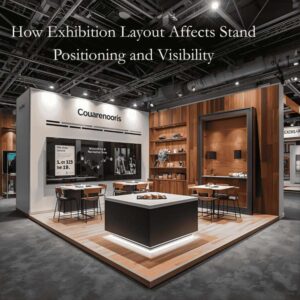
Minimalism is one of the most popular styles for expo stalls right now. Instead of filling the area with text, pictures, and bold features, many firms are choosing clean, open layouts that only show the most important brand messaging. This method works very well when you use neutral colour palettes with carefully chosen accent colours. Minimalist booths not only look more modern, but they also make the space feel calmer and more professional, which makes it easier for visitors to have deeper talks.
The Best Colors for Trade Show Booths in 2025
1. Nature-Inspired Greens and Earthy Tones
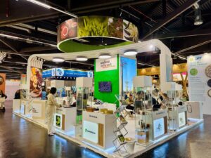
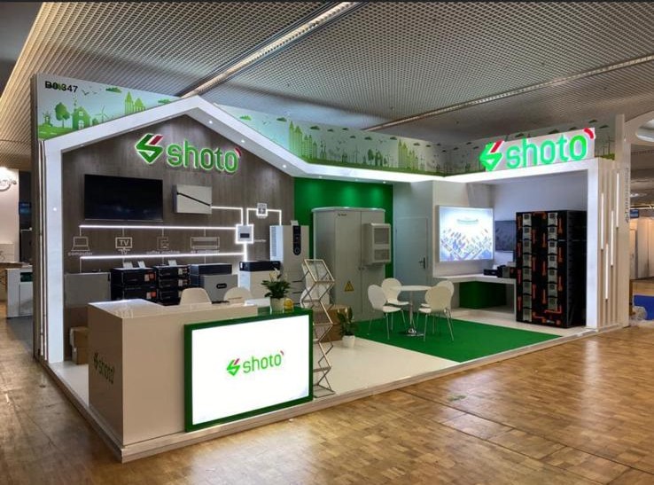
Sustainability isn’t just a phrase; it’s changing the way b2b trade shows are going to be in the future. In 2025, natural greens, earthy browns, and beige colors will be more popular in the designs of expo stalls.
- Why it works: These colors make a space seem tranquil and grounded while showing off a brand’s commitment to the environment.
- Best for: Most useful for businesses in fields like wellness, food, renewable energy, and lifestyle.
- Tip: For a fresh, natural effect, mix muted greens with wooden textures and plants.
2. Bright digital colors: electric blue and bright purple
As digital transformation continues to change the way trade shows work, expect to see more booths using colors that look like they’re from the future, such electric blue, neon purple, and colors that look like they’re from the internet.
- Why it works: These colors are associated with technology, new ideas, and creativity, which makes them great for firms that focus on IT.
- Best for: firms that make electronics, software as a service (SaaS), or IT.
- Tip: Use LED lights to make these blinds look even more modern.
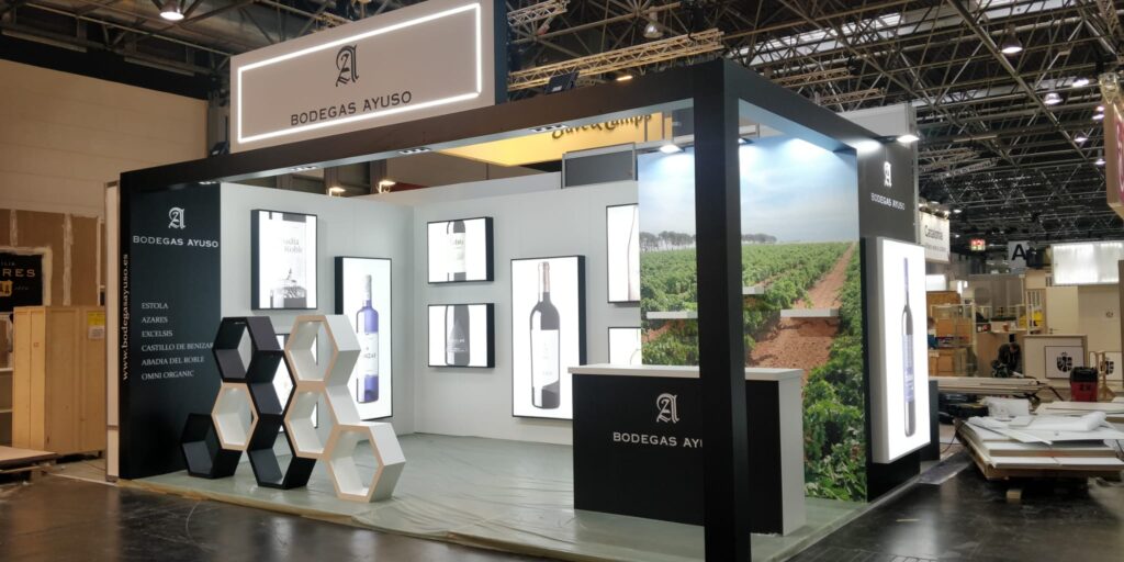
3. Minimalism in one color: black, white, and grey
Minimalist design is getting more and more fashionable in trade fair booths. A monochrome color scheme not only appears elegant, but it also draws attention to your branding and product displays.
- Why it works: Black and white booths stand out in colorful exposition halls because they are simple and elegant.
- Best for: high-end services, fashion, cars, and luxury brands.
- Pro Tip: Use one accent color, like red or gold, to draw attention to important parts of your booth.
4. Soft colors make things calm and friendly.
In 2025, trade show trends are all about soft pastel colours including lavender, mint green, peach, and sky blue. These colours make people feel welcome and at ease, which draws them in without overwhelming them.
- Why it works: Pastels make people feel peaceful, kind, and trustworthy, which is great for making friends.
- Best for: the beauty, health care, education, and lifestyle industries.
- Tip: Use pastels with natural light or soft LED backdrops to make the room feel light and modern.
5. Color blocking with a lot of contrast
Trade show booth design trends in 2025 are leaning towards strong contrasts, such black and neon yellow or white and deep navy. Color blocking makes your booth stand out right away and draws people in from far away.
- Why it works: Colors that are different from each other make people feel energetic and excited, which makes them want to know more.
- Best for: consumer items, entertainment, sports, and new businesses who want to stand out.
- Tip: Use contrast carefully in signs and graphics, not all over the booth, to keep visitors from feeling overwhelmed.
6. Metallic Accents for a Luxurious Look
Brands are bringing back gold, silver and copper tones to expo stall designs to make them look more elegant. A booth design with metallic elements and bright base colours looks expensive and stays in people’s minds.
- Why it works: Metallics stand for success, excellence, and being unique.
- Best for: Jewellery, cars, finance, and high-end B2B brands.
- Tip: Instead of covering the full booth, use metallic finishes on logos, signs, or furnishings.
7. Colours that are important in different cultures and regions
As international events become more common, multinational corporations are adding cultural color psychology to their booths. In Asia, for instance, red is thought to be lucky, and in Europe, blue is thought to be trustworthy.
- Why it works: Making the colors of the booths match what people expect in that area helps marketers connect with people in that area better.
- Best for: Companies who go to trade shows in Dubai, Europe, and Asia, among other places.
Before you choose the colors for your booth, do some research on the trends in the trade show sector in your area.
How to Pick the Best Colour for Your Trade Show Booth
It’s not enough to just follow trends when choosing the perfect colour for your trade show booth. A trendy colour scheme can make your booth look modern and interesting, but the most important thing is to make sure the colours match your brand, target demographic, and long-term goals. A carefully planned colour scheme may change how people feel, make your business more recognisable, and give visitors an experience they’ll remember that sets you apart from the competition. Here are some expert ideas to help you choose the best colors for your booth:
1. Stick to the colours of your brand
Trends come and go, but your brand’s identity will stay forever. Using the same colors for your brand throughout all of your touchpoints, from your website and social media to your trade show presence, makes everything look the same. People should be able to tell right away that your booth is yours without having to think about it. If you want to use trendy colors, think about mixing them in with the colors you already have instead of replacing your main brand colors.
2. Learn about the psychology of colour
Colors may make people feel things and change how they see your brand. For instance, blue is a common color in B2B trade shows since it conveys trust and professionalism. Green stands for growth and sustainability, while red stands for energy, passion, and urgency. You can control how visitors feel when they come to your booth and make sure your design supports your brand message by choosing colors that match the psychological response you want to generate.
3. Try out colors in the light of the show
One of the biggest mistakes firms make is choosing colours that seem amazing in a design mock-up but look drab or altogether different when they are shown in an exhibition hall. Bright overhead lights or spotlights are common at trade shows, and these can change the way colours look. Before you finish designing your expo stall, try out your colour scheme under similar conditions to make sure it conveys the right mood and doesn’t surprise you on the big day.
4. Combine style with usefulness
It’s interesting to try out new booth colors that are popular right now, but functionality should always come first. A bright neon colour scheme could get people’s attention, but if it makes your visuals look bad or makes it hard to find your way around, it might impair the visitor experience. The finest designs for show stands are those that are stylish, useful, and easy to use. Your colors should draw attention to key sections like product displays, digital screens, or interactive zones, but they should also make sure that the whole layout is easy to get about.
5. Plan for the long term when buying reusable booths
If your business buys a modular exhibition stand or a custom trade show booth that will be used at more than one event, it’s even more vital to choose the right colors. Pick colors that not only look well now, but will also look good in the years to come. For reusable constructions, neutral bases with flexible accent colors usually work best. This lets you make tiny changes to the look of the booth while still maintaining it in line with your corporate identity.
Trends in the trade show industry outside colour in 2025
Color is still an important feature of booth design, but it’s not the only thing that matters. Exhibitors in 2025 need to think about bigger trends in the trade show business that affect how visitors expect to interact with brands and what they want to see. Here are some of the most important changes that will affect how booths are designed in the future:
1. Sustainability is the main focus
Eco-friendly exhibition stands are no longer just nice to have; they are required. Visitors are more and more interested in brands that show they care about the environment. Booths made of materials that can be used again, recycled, and energy-efficient lighting not only have less of an effect on the environment, but they also transmit a strong marketing message. Using colors that are natural or earthy, together with eco-friendly booth design, will help show that you care about the environment even more.
2. Using technology to get people involved
Static displays are no longer useful. Today’s trends in trade show booth design are all about getting people to interact with technology. More booths will have AR/VR experiences, touchscreens, LED walls, and demos that people may engage with. These technologies make stories better and keep people interested in your brand. Color is also important. You may use dynamic lighting and digital displays to match the colors of your booth and make the whole experience more memorable.
3. The Growth of Hybrid Events
The move towards digital around the world has changed how trade exhibitions work. Many events will still mix real and virtual aspects in 2025, making hybrid experiences. This implies that your booth design needs to appear good in person and online. When picking colours, think about how they will look in both real life and on a screen. This will make sure that your booth looks well in pictures and on screen.
4. Personalisation to make connections stronger
Generic booths are no longer enough. Personalised visitor experiences are becoming more and more popular at modern B2B trade shows. Booth design changes to meet the needs of specific target audiences. This may be personalised demos, digital interactions that are suited to you, or booth portions that can be changed. Colours can also assist set the mood. Small changes in lighting or thematic accents can help set the mood for different groups of people.
5. Clean design and minimalism
Minimalism is one of the most popular styles for expo stalls right now. Instead of filling the area with text, pictures, and bold features, many firms are choosing clean, open layouts that only show the most important brand messaging. This method works very well when you use neutral color palettes with carefully chosen accent colors. Minimalist booths not only look more modern, but they also make the space feel calmer and more professional, which makes it easier for visitors to have deeper talks.
Conclusion
As the trade show industry changes, color is still one of the best ways to design a booth. In 2025, the best color trends for trade show booths will be a blend of sustainability, digital vitality, minimalist elegance, and cultural flexibility.
Your color choice should match your brand’s personality and the expectations of your audience, whether you choose nature-inspired colors, modern digital colors, or luxury metallics. When you add these trends to smart booth layouts, interesting visuals, and cutting-edge technology, you’ll have a display that people will never forget at your next trade show.
In the cutthroat world of trade fairs, your booth is more than just a structure; it’s a platform for your brand story. The appropriate colors can make you stand out or blend in.
At Exhibit Elevate, we know that your booth is more than simply a structure in the very competitive world of trade shows. It’s a way to convey a story. We know how to develop unique exhibition stands, modular solutions, and portable trade show displays that not only show off the current trends but also tell your business narrative in a clear and creative way.
The appropriate colors might help you stand out or blend in with the setting. Exhibit Elevate can help you make sure that your trade show booth not only follows the latest trends for 2025, but also makes a lasting impression on your audience.