Mistakes International Brands Make When Exhibiting in Germany (And How to Avoid Them)
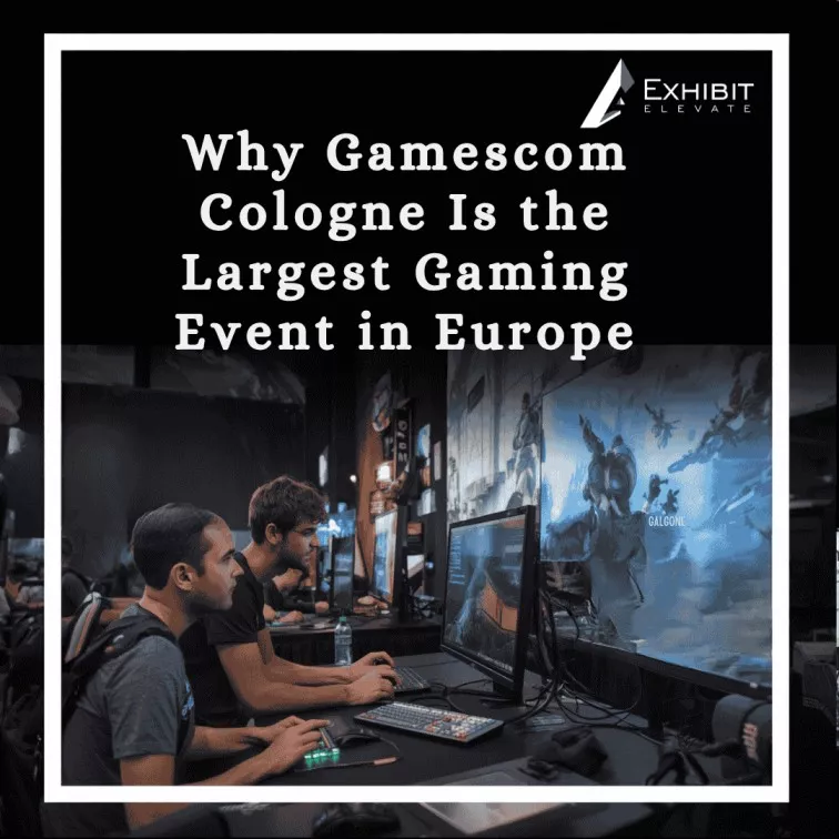
Let’s be honest about something. Germany is not just another country on the trade fair circuit. It is the trade fair capital of the world. More than two-thirds of the world’s leading international exhibitions take place here — Hannover Messe, Interpack, Automechanika, IFA Berlin, electronica, Gamescom. The numbers are staggering, the competition is relentless, and the stakes are as high as they get in business. And yet, every year, international firms go to German trade fairs and make the same mistakes when exhibiting in Germany. Not little mistakes. Expensive, brand damaging, lead killing mistakes that might have been prevented totally with a little bit of prep and the right people in their corner. Whether you are a first time exhibitor or a fifth time exhibitor, this handbook is for every brand exhibiting in Germany. We’ll discuss the most common mistakes we notice, why they happen, and what you can do to avoid them. By the time you’ve finished reading this, your next German trade fair will seem drastically different. Germany hosts over 150 major international trade fairs per year. Getting your exhibition stand wrong here doesn’t just cost you money — it costs you the room. Mistake 1: Treating a German Trade Fair Like Any Other Show The first and most common mistake is simply underestimating the environment. Brands that exhibit successfully in the US, the UAE, or Southeast Asia arrive at Messe Frankfurt or Koelnmesse with the same stand, the same approach, and the same expectations — and then wonder why the results are different. Here is the reality. German trade fairs operate at a different level of professionalism. Visitors are more technologically literate, analytical and significantly less likely to fall for glitzy advertisements. A German purchasing director touring the floor at Hannover Messe is not there to be entertained. They are there to examine, compare and make tough sourcing selections. What this means for your booth: Visual appeal is not enough, your show stand design must demonstrate credibility and technical authority Demos of products should be tight and substantive…not theatrical Your team needs to be briefed on handling detailed technical questions from day one Your collateral needs to be informative and data-led, not just glossy brochures The brands that perform best in Germany treat it as a different market from day one of planning — not an afterthought. Mistake 2: Missing the Messe Deadlines German Messe venues run on tight, strictly enforced schedules. Build-up windows open and close on a fixed timetable. Late contractor registrations are declined. Late material submissions are not accepted. If your stand is not ready when the show opens, it is not ready — and there is no negotiating your way around that. International brands frequently underestimate how early the paperwork process starts. The Messe documentation requirements — contractor registration, structural engineering submissions, electrical plans, rigging applications — often need to be submitted weeks or even months before the show opens. This is not bureaucracy for its own sake. German venues are managing hundreds of exhibitors simultaneously, with strict safety and logistics protocols. The typical Messe documentation timeline: 12–16 weeks before: Stand design finalised and contractor registered with the venue 8–12 weeks before: Structural engineering documents submitted for approval 6–8 weeks before: Electrical plans, rigging applications, fire safety certificates submitted 4–6 weeks before: Logistics and freight arrangements confirmed with venue handlers Build-up week: Stand installed within the venue’s strictly allocated build-up hours Miss any of these windows and the consequences cascade. A late structural submission means your design cannot be approved. An unregistered contractor cannot access the hall. This is why working with an Exhibition Stand Builder in Germany who already holds the necessary venue registrations is not optional — it is the only way to guarantee your stand goes up on time. We have never missed an installation deadline at a German venue. Not once. That is only possible because the process starts early and every step is tracked. Mistake 3: Ignoring German Electrical Regulations European electrical standards are very different from those in North America, Asia and the Middle East. The voltage in Germany is 230V/50Hz. Note: Equipment purchased in the USA (110V/60Hz) requires appropriate voltage conversion, not just plug adaptors. Apparatus imported from countries with differing safety certification standards may not meet the TÜV or CE requirements of German venues and German law. This is not a minor technicality. Venues can refuse to connect stands that do not meet their electrical regulations, and they will. We have seen brands arrive with beautifully designed stands, expensive AV equipment, and illuminated displays — none of which could be powered up because the electrical setup was not compliant. The key electrical compliance requirements for exhibiting in Germany: All electrical installations must be completed by a certified electrician registered with the venue Electrical plans must be submitted to the venue before build-up for approval Equipment must carry CE certification to operate in Germany US equipment running on 110V requires either dual-voltage models or certified step-down transformers Extension leads and power distribution must meet German DIN standards All lighting must be mounted and directed so as not to spill into neighbouring stands The safest option is to get your AV equipment and electrical components from Germany or Europe, or to check compliance with your exhibition stand builder in Germany before anything ships. Mistake 4: Skipping Translation and Localisation You’d be astonished by the number of multinational firms who turn up to German trade fairs with displays, collateral and internet content all in English. Generally speaking, some make the case that German business people speak English well. And that is so. But it completely misses the point. Language is not just about being understood. It is about respect, professionalism, and showing that you have made the effort to meet your audience on their terms. German visitors notice when a brand has invested in German-language communication. They notice even more when a brand has not. But localisation goes further than translation. German business communication has specific conventions: German professional copy is formal in